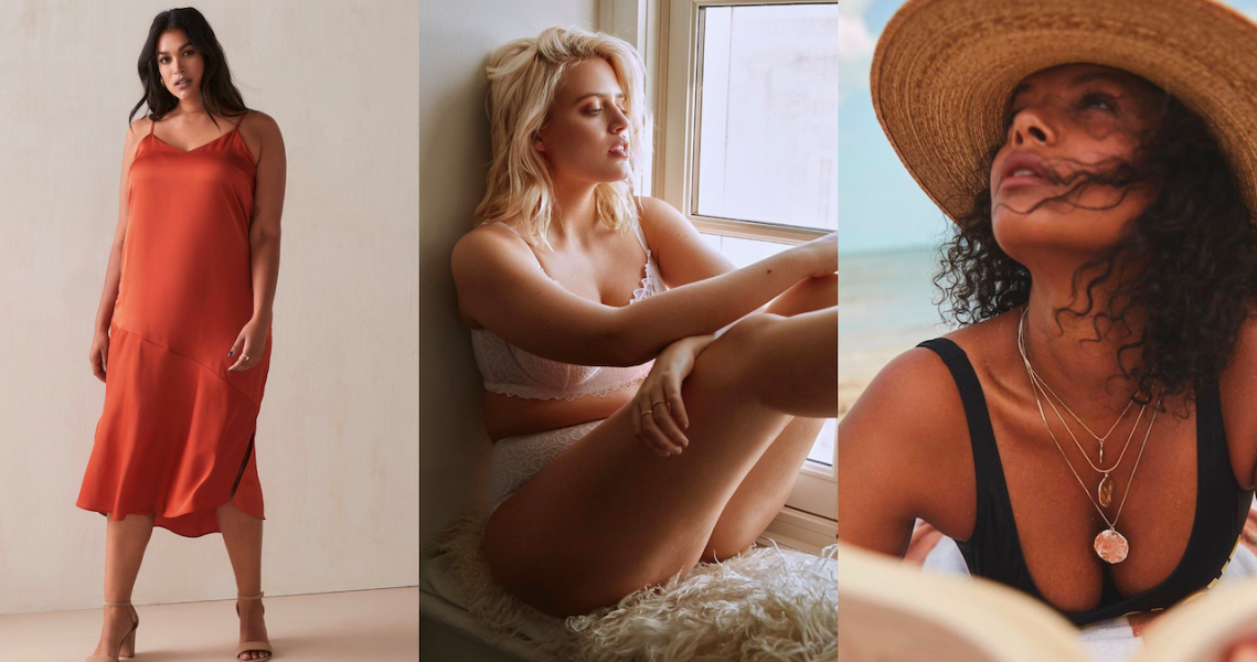
In May, Canadian plus-size fashion brand Addition Elle announced a plan to completely overhaul the shopping experience for its customers, focused on a more sophisticated brand image and a stronger brand voice across mobile, e-commerce and physical retail.
The thinking from Addition Elle was that most women shopping for plus-size clothing don’t get the same shopping experience as women shopping for “straight sizes” at places like Zara and Aritzia. While available options for these sizes in fashion have multiplied in the last few years, with companies like Good American and Hours hitting the market, plus-size departments are often lacking. To make shopping for plus-size clothes easier and more enjoyable, Addition Elle has updated its online experience.
“Stores for years made it clear that you should be ashamed of yourself, either by not carrying plus-sizes at all, offering them exclusively online, or putting plus-size departments or sections somewhere in the back where they cannot be seen or on a different floor,” said Gita Omri, fashion designer and founder of size-inclusive brand Gita Omri. “Macy’s might have four womenswear floors, but [plus-size women’s clothing] is on the seventh floor with infants? It makes no sense. It’s part of a culture of hiding and shaming,” she said.
For Addition Elle, the goal was to create a website optimized for mobile that felt more like something customers would get when visiting & Other Stories online, or Zara: plenty of big editorial images showing how to style different pieces in the collection, either alone or with other pieces from the brand, said Elara Verret, vp of digital strategy at Addition Elle. On top of making the brand feel put-together, the aim was to give the brand a strong brand voice.

“We want to show [the customer] how seamless it can be to shop online and in-store, by giving suggestions on ways to wear trendy statement pieces or basics, including how they can work with the rest of the wardrobe she already has at home. We have built a digital storefront that is focused first and foremost on fashion, taking an editorial and educational approach to showcasing our extensive product offerings,” said Verret.
There’s a lot of white space on the site. It’s designed to be clean, so the photos and clothing really pop. Also, it makes it easier to navigate so customers can find things they like quickly.
Ad position: web_incontent_pos1
The company worked with agency Work & Co to completely redesign the e-commerce site, as well as some of its 90 retail locations. Rachel Bogan, partner of product management at Work & Co, said the thinking for these design elements might not seem completely revolutionary. Clean, elevated website design and more inspiration-driven content online is something that many brands already do. However, Bogan said for plus-size shoppers those high-quality experiences really don’t exist.
Some companies are doing a lot to improve the experience for shoppers, and even traditional retailers are starting to catch on. For example, mall brand Lane Bryant has started featuring user-generated-content on its website, inviting customers to post their own photos showing how they’ve styled Lane Bryant products, which works to inspire other shoppers.
Universal Standard launched the See It In Your Size tool in March, which shows customers every single product the company makes in every single size it sells, 00-40. The company tracked down a model that fit each size and worked to shoot those models in all items sold at Universal Standard stores and online. Customers view 1.2 million on-model product images a day on Universal Standard’s website, according to the company. That’s roughly 36 million a month.
Gita Omri takes a similar approach, showing a diverse range of sizes for her extended-size line. For its website, she always shoots a size 2 model and a size 20 model in the same frame, wearing the same outfit, so customers can see how the product looks on different body types. Tanya Taylor provides a similar look at her styles, showing each on a straight-size and a plus-size model.
“We put so much effort in both size ranges so the fit is just right for as many people as possible. We celebrate by showing models of different sizes and different colors. We want to show that size doesn’t reflect your beauty,” Omri said.
Ad position: web_incontent_pos2
And while Omri said she’s encouraged by the wave of DTC brands offering extended sizing, she still has some problems with some of the brands.
“One of the problems I see with them is that if you take away the logo on the website, it’s all the same stuff. There is some attention to design but mostly not. It’s all very basic and they call it effortless, which to me just means lazy,” Omri said.


